Control Elements 控制元件
Gain an overview of the different control elements that make up MASSIVE X's UI.
大致了解构成 MASSIVE X UI 的不同控制元素。
MASSIVE X's user interface features a number of different controls. The following overview explains how to interact with them using a mouse.
MASSIVE X 的用户界面具有许多不同的控件。以下概述说明如何使用鼠标与它们进行交互。
Name | Image | Description | Key Commands | |
|---|---|---|---|---|
Dropdown menu |  | Used to select from a list of options relating to the respective section or function. |
| |
Dropdown menu (with display) | 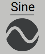 | Used to select from a list of options relating to the respective section or function. The selected entry is visualized in the display. |
| |
Dropdown menu (extended) |  | Used to select from a list of options relating to the respective section or function. |
| |
Unipolar knob (with modulation) | 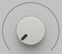 | Used to adjust parameters in the range of 0% to 100% from left to right. |
| |
Bipolar knob (with modulation) | 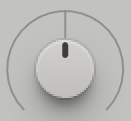 | Used to adjust parameters in the range of -100% to +100% from left to right. The center position is 0%. |
| |
Wavetable knob | 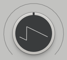 | Used to adjust the wavetable position of the corresponding Wavetable oscillator. The display at the center of the control visualizes the resulting waveform. |
| |
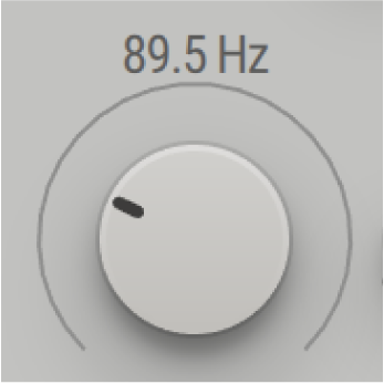
Unipolar knob |  | Used to adjust parameters in the range of 0%-100% from left to right. |
| |
Bipolar knob |  | Used to adjust parameters in the range of -100% to +100% from left to right. The center position is 0%. |
| |
Macro knob |  | Used to adjust parameters assigned to the Macro. Refer to Macros and MIDI Control. |
| |
Macro icon |  | Used to assign a Macro to parameters. Refer to Macros and MIDI Control. |
| |
Controller icon |  | Used to assign the respective midi controller to parameters. Refer to Macros and MIDI Control. |
| |
Page tab | 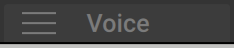 | Used to show the respective page in the Editor. |
| |
Modulation source tab | 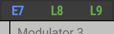 | Used to show the respective modulation source in the Editor. |
| |
Modulation icon |  | Used to assign a modulation source to parameters. Refer to Assigning Modulation. |
| |
Pitch control | 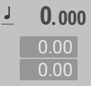 | Used to control the pitch and pitch modulation amounts of components that track MIDI pitch. |
| |
Numeric control | 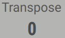 | Used to adjust parameters in a specific range of values. |
| |
Rotary selector | 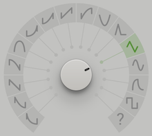 | Used to select from a predefined set of different states or values. |
| |
Slider |  | Used to adjust parameters in the range of 0% to 100% from bottom to top. |
| |
Quantized slider | 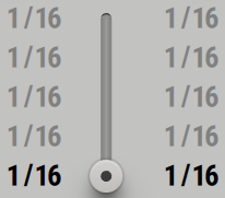 | Used to select from a user-defined set of different states or values. |
| |
Function button |  | Used to switch functions on or off. |
| |
Module button | 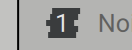 | Used to switch modules on or off. |
| |
Auxiliary button |  | Used to switch auxiliary functions related to adjacent controls on or off. |
| |
Mode selector | 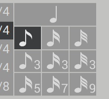 | Used to select one of several modes. |
| |
Routing module | 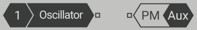 | Used to make connections between modules on the Routing page. |
| |
Parameter readouts for knobs |
| Used to display the exact value of a knob control. |
| |
Parameter readouts for sliders | 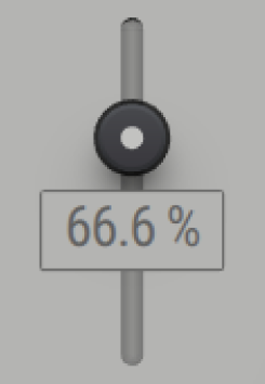 | Used to display the exact value of a slider control. |
| |
Parameter readouts for Macros | 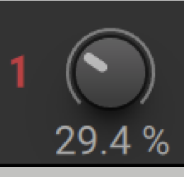 | Used to display the exact percentage value of a Macro control. |
|